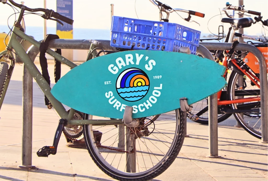
This was a personal design project to reimagine what a modern logo could look like for Gary’s Surf School in Muizenburg Cape Town…
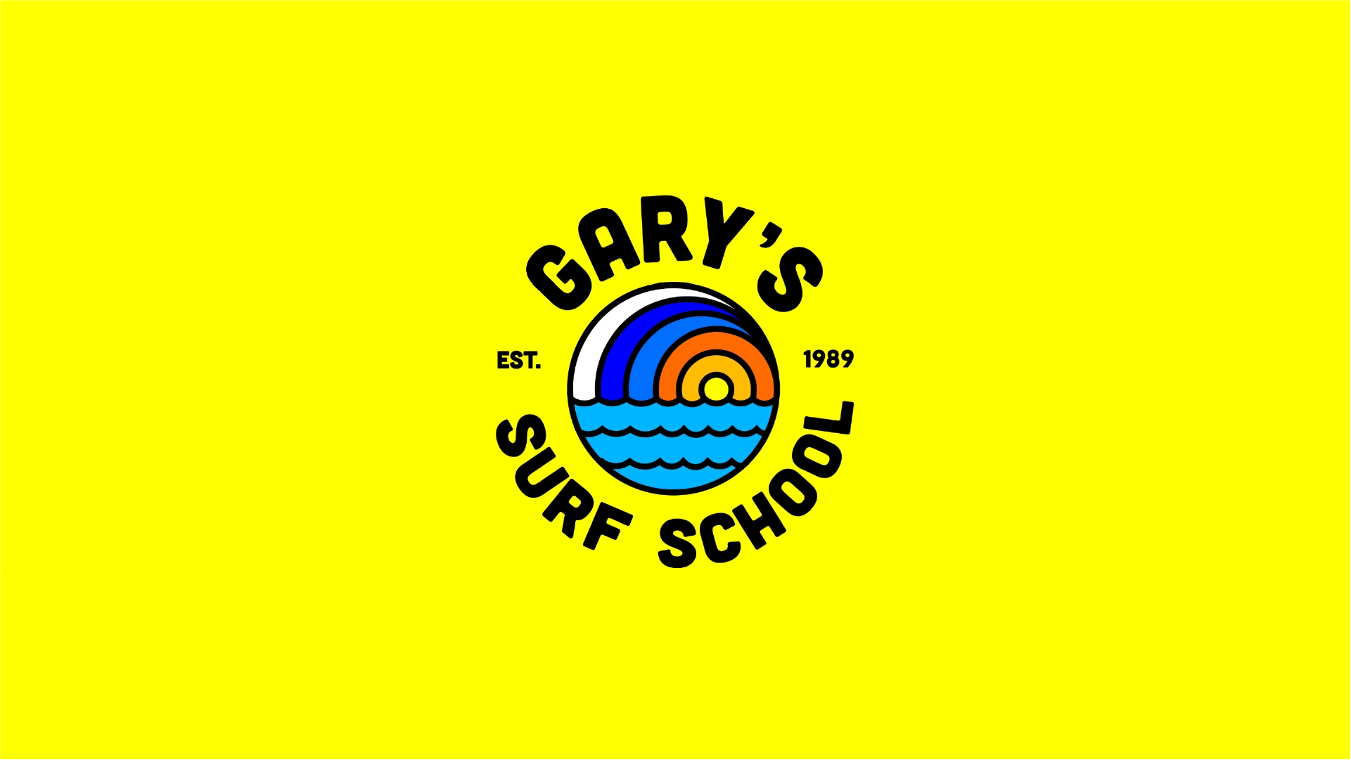
We had this idea to refresh and strengthen Gary’s Logo. It brings a new brand equity to the mark bring a whole new fresh and bold energy to the oldest surf school in south Africa
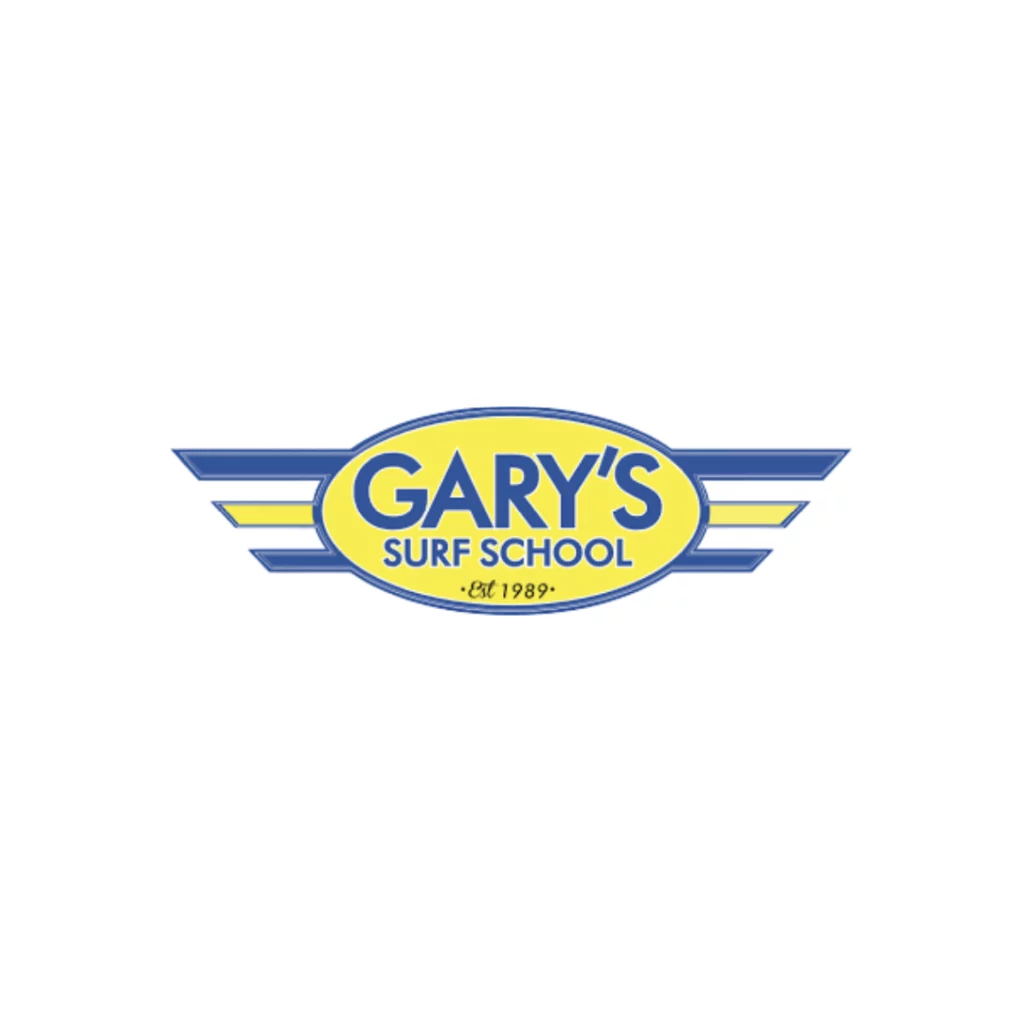
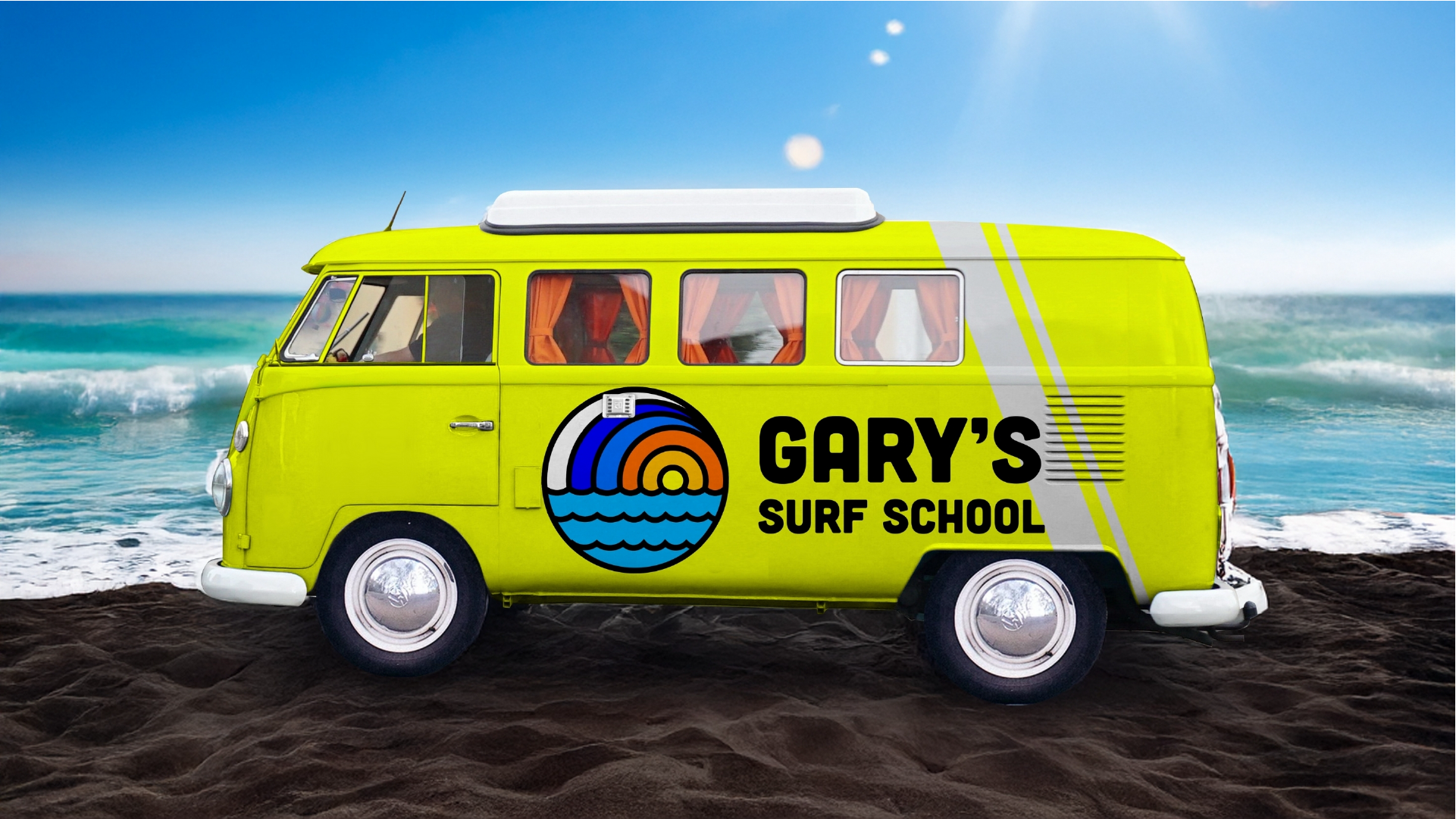
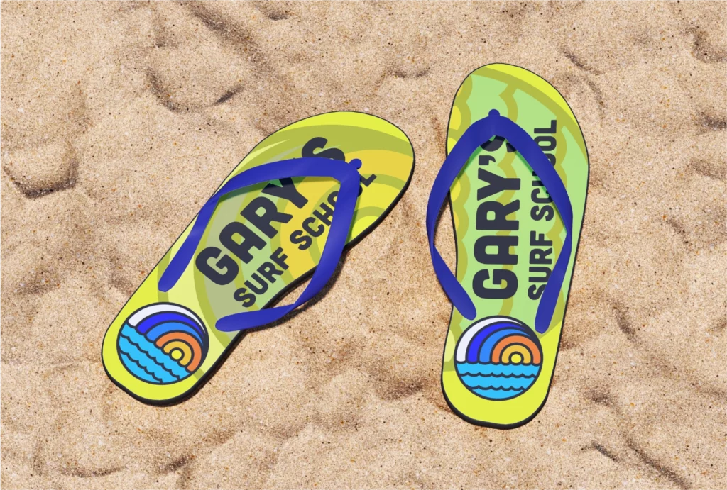
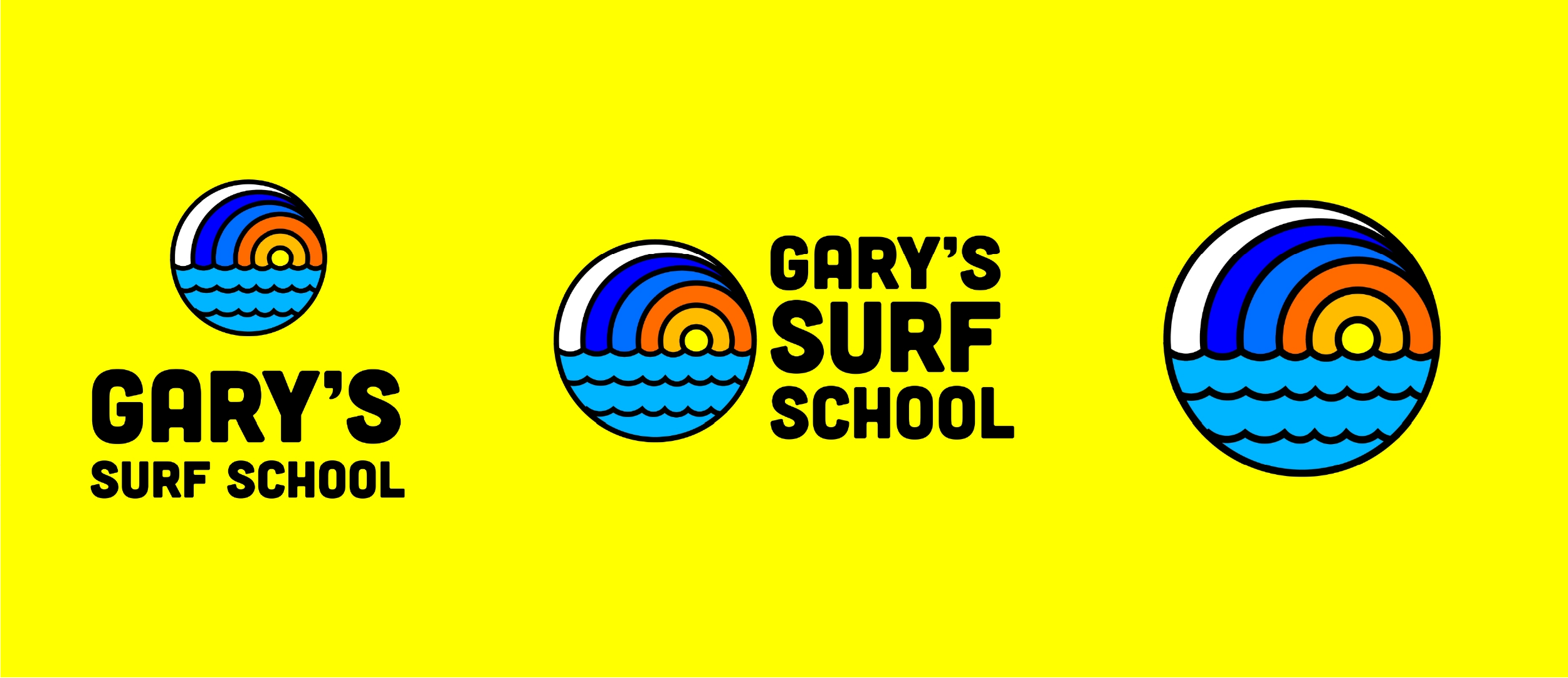
The Current logo…while unique, can definitely be be difficult to use at small scale, where this new design is versatile to be used in any place you need to leave your mark..
Simply thick line design emphasised the bold, bright and fresh engery that Gary’s deserve.
OLD LOGO
NEW LOGO
THIS REIMAGINED DESIGN WILL BRING A LOT MORE BRAND RECOGNITION AND VERSATILITY TO ONE OF SOUTH AFRICA'S LOCAL LEGENDS